Showing posts with label painting. Show all posts

Thursday, 19 September 2013

Animals in Art

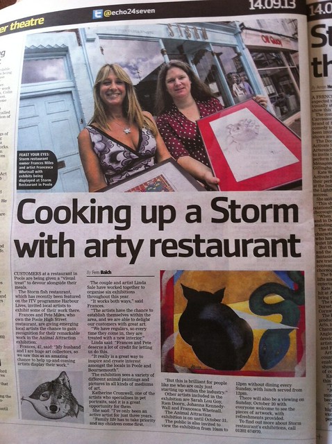
During September and October some of my animal linocuts are part of a great group exhibition at Storm restaurant in Poole. The exhibition features work by six artists with very different styles. Below are examples from some of the artists and a lovely little article that was in last Saturday’s local Echo. Yes, that’s me in the paper, urgh!

 
Egyptian Cat by Linda Sale  ~ http://www.linda-sale-fine-art.com/


Chicken by Sarah Lou Goy - http://www.pinkspiral.co.uk/
 
 
Dog portraits by Katherine Cromwell - http://www.facebook.com/KatherinesPaintings


A big thank you to Linda Sale who organises the exhibitions at Storm and to Frances Miles the restaurant owner who does a great job supporting local artists. Also, thanks to Katherine Cromwell for arranging the Echo article! I was also lucky enough to have work on display at Storm last summer, when they were filmed for the series 'Harbour Lives' with Ben Fogle. I know it's not a huge claim to fame but some of my watercolour still-lives were on the walls of the restuarant in a few shots of the series!

More info and shots of the exhibition here - http://stormart.webs.com/


Friday, 23 November 2012

Black Friday & Cyber Monday - Weekend Sale

For Black Friday/Cyber Monday weekend I've reduced 12 of my favourite original watercolour paintings by 20%!


Have a look at my sale section for a closer look.
 
AND I'm also offering 10% off your whole order with the code 10OFFBFCM2012.
 
Sale ends on Tuesday 27th Nov.
 
I've also just added a new selection to my range of cards which I'm quite exciting about. Here are some of my favourites:


You can see all of my individual cards here and all my card and postcard sets here.


Friday, 29 June 2012

Summer Art & Craft Workshops 2012

The Arlington Arts Cafe in Bournemouth is running an exciting series of art and craft workshops this summer. There will be friendly tuition provided in the beautiful setting of the café terrace, overlooking Bournemouth’s Lower gardens.

Ever fancied learning how to crochet, sculpt or print? Are you a keen amateur painter or a complete beginner looking to improve your skills? Then these are the workshops for you!

The workshops run from late June right through into September. Each session will be for 2 hours in the morning or afternoon and will require no previous experience. Adults and children welcome! (all children must be accompanied by an adult ).

I will be running a number of Relief Printmaking workshops as part of the summer season. From potato prints to wood engraving, relief printing is a great way to create exciting and repeatable printed images. On my workshops you will be taken through the steps to create your own original, handmade prints using simple equipment including
plasticine, card and polystyrene. 


The price for each 2 hour workshop is just £7.50 per person and includes a free drink!

Booking is not essential, but recommended to avoid disappointment. All paper, paints and equipment will be provided, so you are welcome to just turn up on the day.

To book, or find out more leave me a comment or -

Book on one of the workshops on Facebook
or
Phone the Arlington Arts Café on 01202 552879 or contact  Ruth Kelvin on 0758 6431184
or
Email enquiries@arlingtonbournemouth.co.uk or email ruthkelvin37@gmail.com.
or
visit the Arlington Arts Cafe website

This series of Summer Art workshops have been arranged and co-ordinated by Ruth Kelvin of the RK Collection.

For further info and the full schedule see the Arlington Arts Cafe website

Tuesday, 7 February 2012

RWS Contemporary Watercolour Competition 2012

Since going full time as an artist at the beginning of 2012, one of my main aims was to get a painting accepted into the Royal Watercolour Society's annual open exhibition. The subject guidelines for the exhibition are completely open, with the only guidance being:

(The competition) aims to encourage innovation and experimentation in watercolour painting, spanning work on paper in watercolour, acrylic, gouache, pen & ink and watercolour mixed media.

With only a few weeks to prepare for the deadline I worked on several new paintings (see my earlier blog New year, New career, New paintings!). But, when I finally managed to make a decision on what to submit I selected 2 of the new paintings, and a portrait I painted over a year ago, an enduring favourite of mine, from the portraits I've painted for JKPP (see my earlier blog Julia Kay's Portrait Party). After some almost catastrophic hiccups with the online submission, my entries were in and I only had a few days to wait for the results...

I'm very excited to announce that my portrait has been accepted!
The exhibition will be held at Bankside Gallery between 24th February - 14th March 2012. If you haven't been to Bankside Gallery before, I thoroughly recommend it. The home of the Royal Watercolour Society (RWS) and The Royal Society of Painter-Printmakers (RE), it's a lovely little gallery, right beside Tate Modern, on the Southbank. It generally shows small - medium sized, affordable and beautiful art, and I'm a huge fan of many of the artists who show work there.

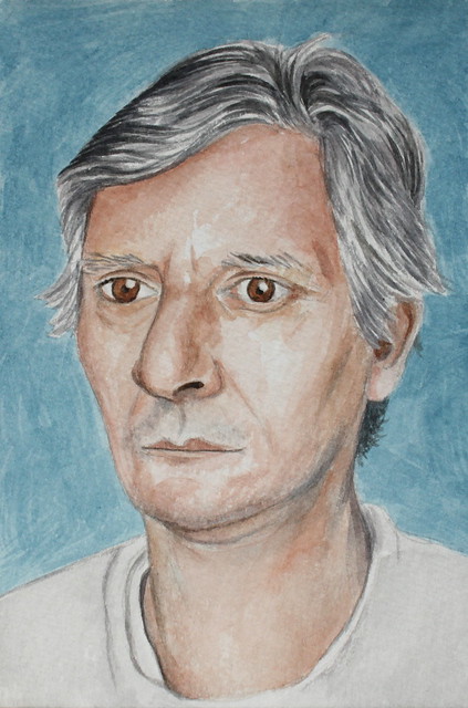
The accepted painting:

Portrait of a Man (titled 'Straw Herring' in a previous life)


For more information on the RWS exhibition and the other successful artists have a look at Katherine Tyrrell's great blogpost
 
If you like my work...
Check out my online Gallery & shop - www.francescawhetnall.etsy.com

I now have a Facebook page, where you can keep up to date with my latest work, exhibitions and discounts if you 'Like' my page: http://www.facebook.com/FrancescaWhetnall

You can also find me :

on Flickr - http://www.flickr.com/photos/franny_b
on CafePress - http://www.cafepress.com/whetnallart
And at my website - http://francescawhetnall.co.uk/

Monday, 6 February 2012

The Lovers - Watercolour & Card for Valentines

Here is my Valentine's watercolour painting inspired by tarot, in particular the memorable card that features in the James Bond film Live and Let Die. A Crescent moon lights up a star filled, deep blue sky while the Lovers kiss by moonlight.

Romantic, passionate and starlit, I think this painting would make a beautiful and completely unique valentines gift. What could be more surprising and special than receiving an original painting from your Valentine? I've also had a few cards printed with this design and both the painting and card are available from my little online shop and gallery! :-)

If you like my work...
Check out my full stocked online Gallery & shop - www.francescawhetnall.etsy.com
I now have a Facebook page, where you can keep up to date with my latest work, exhibitions and discounts if you 'Like' my page: http://www.facebook.com/FrancescaWhetnall
You can also find me :
And at my website - http://francescawhetnall.co.uk/

Tuesday, 24 January 2012

New Year, New Career, New Paintings!

The week before Christmas was the end of my career in IT. After more than 10 years working as an IT consultant, developing code, analysing systems and managing a team, I've taken the plunge and traded it all in for the chance to make a lifetime's dream a reality - to become an artist, full time!
It's going to be a major challenge, and will take a lot of hard work, new skills and struggles, but I'm ready for it!

In my first few weeks I've been researching, planning, stocking up my shop and starting to make the most of my time to develop my art and find my direction. I've also been working to a couple of exhibition deadlines - more on that to follow.

For now, here are a couple of my latest paintings, with some photos of the stages and how they were built up:

Pears for Breakfast

Planning - I started by arranging a still life, choosing complimentary colours and some of my favourite objects (you might recognise the central vase from some of my other paintings). The colours were also based around some beautiful yellow tulips and lovely conference pears. In the background of the still life set up I propped up one of my framed monoprints, and a book on botanical art. Once I was happy with the arrangement I made a quick sketch in pencil and watercolour, which allowed me to see anything that I needed to adjust, and got me started thinking about the structure of the painting.

First steps - I wanted the tulips to be the main focus of the painting, so without making an preparitory drawing on the paper, I started building up the tulips with loose bright yellows. I tried to keep each mark fresh, and used watersoluble coloured pencils, wax crayon and oil pastels throughout the painting, in addition to the watercolour.


Next - After completing most of the tulips and leaves I started to paint in the vase and some of the background - the little blue arches, and a bit of the cream book cover. I then tackled the other main features of the arrangement - the blue and white tea-pot, the lovely pears, the start of the mustard coloured vase, and the beginnings of the willow pattern plate:


Adding the background - The next step was to start tying the seperate areas together, and building up the background. I've used some spots of grey oil pastel to link up the middle section to the bottom left of the painting. I've added more of the monoprint and book cover behind the tulips:


Adding structure - Now that the painting is coming together I've added in a few lines to try and improve the composition and lead the eye around the painting. To echo the plate and bowl in the foreground I've added another curved edge on the left, a possible table edge. I've also added a couple of diagonal lines to draw the eye in to the composition.


Final stages - I've used some more of the deep blue from the central vase on the table edge, to balance the strong colour across the painting. For the remaining background areas I've used more subtle greys and cream, so that they don't distract from the main subject too much. There was a lovely red squiggle pattern in my framed monoprint in the background, which I've extended out from the monoprint to the far left top corner, as if the squiggles are floating from the tulips. I've used masking fluid to suggest the pattern of the green and gold tin which the tea-pot is standing on. I've also linked the apple into the painting by the addition of the rusty red sliver on the right of the pears.

The finished painting - Pears for Breakfast

Watercolour Mixed Media  - 48cm x 36cm


David Hockney

I'm a huge fan of David Hockney and I've been wanting to paint his portrait for some time, it was great to have the time to do it!
I took quite a few (bad) photos of this as I went - I find it really helps to see your progress on screen, it's the same as looking at it from a distance really. I'll save you from a detailed description this time, the main stages were:

  1. Pencil drawing directly on the watercolour paper, in an attempt to keep the energy of the drawing, rather than tracing from a separate drawing.
  2. Watercolour for most of the painting but I've used some watersoluble coloured pencil to build up the darkness and depth of parts of the face.
  3. When I'd almost completed the portrait i decided to add a simple background.


Finished!


If you like my work...

Check out my full stocked online Gallery & shop - www.francescawhetnall.etsy.com

I now have a Facebook page, where you can keep up to date with my latest work, exhibitions and discounts if you 'Like' my page: http://www.facebook.com/FrancescaWhetnall

You can also find me :
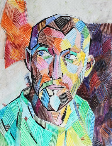
And at my website - http://francescawhetnall.co.uk/


Monday, 14 November 2011

Art Therapy for Heroes

At school when I took a careers test, 100 multiple choice questions which when fed into a computer told me my top 10 careers, the results included Art Therapist and it’s always held a real interest for me. In addition to my love of art and passion for creating, one of my main interests has always been psychology and mental well-being. If it hadn’t been for the long years of study needed (I think it was 7), perhaps I would have gone for it and be a happy art therapist today. Who knows, perhaps one day I’ll get there!

A fascinating documentary special by the Culture Show ‘Art for Heroes’ broadcast on Remembrance day, 11/11/11 gave an interesting and convincing insight into how art therapy is helping ex-servicemen deal with the symptoms of post-traumatic stress disorder  (PTSD).

The reporter, Tim Samuels met with a number of veterans of recent British conflicts including the Falklands and Northern Ireland, each of whom shares some of their personal struggles with PTSD as a result of their military career. The programme gave a shocking insight into the symptoms of PTSD, revealing that it can take years for sufferers to seek help for the condition – many of them going through alcohol and drug addictions and failed marriages during that time. Through a unique art therapy programme run by the only military based art therapist in the country, the documentary goes on to show how art is helping a group of war veterans come to terms with some of their experiences. It shows how the process of drawing, sculpting and painting provides a way to tap into violent or difficult past experiences or recurring thought patterns, and provides a release for those thoughts and feelings.   

I can’t put it as well as the documentary, so I’ll stop there and just recommend you watch it!

It’s really moving and thought provoking and well worth a watch – Art for Heroes - A Culture Show Special

I also found this great Art Therapy blog whilst researching for this post - Art Therapy Blog .
Adrian Hill - One amongst Many

Adrian Hill (1895 – 1977)

In 1917, Adrian Hill was the first official war artist appointed by the government to record scenes of the First World War, these works are now housed in the Imperial War Museum. Hill subsequently introduced the concept of art therapy into hospitals after being confined for TB. Hill coined the term "Art therapy" in 1942, and in 1945 published his ideas in the book "Art Versus Illness".

Hill thought that when the patient's physical resistance was at its lowest this somehow rendered the "animal ego" quiescent and allowed the creative powers of the "spiritual essence" to come through in works of art. On recovery, these creative powers would tend to wane back to the "pictorial commonplace". He recognised that war was not only physically destructive but also damaged "minds, bodies and hopes" and that the need for psychological healing was even more important than mere physical repair of "property and estate". He believed that the practice of art, "in sickness and in health" , could turn society away from war by making artistic creativity more appreciated. He saw art therapy as becoming an integral part of the National Health Service.

Adrian Hill info taken from Wikipedia - Adrian Hill

Saturday, 17 September 2011

Junk Art Book - upcycled art

Inspired by Kim Schuster's beautiful Junk Book I just had to have a go.

I've been wanting to do something like this for years and it's been great fun so far.
I've used cereal box and other thin card packaging to create the pages which I've painted with a mixture of acrylic gesso, acrylics and some poster paint. I punched holes in them before painting, and I'll bind it together with ribbons and string when it's finished.

Next step will be a bit of collage and some ocean themed drawings and paintings..

Here is a slideshow of my progress so far:


See the whole set on Flickr here - Junk Art Book - Step by Step

Monday, 2 May 2011

Postcard Portraits

I'm still loving JKPP and still trying out new styles. I just can't help doing something different everytime. I'm sure I could develop more if I stuck to one style for a bit longer but I just can't resist switching techniques and medium after almost every picture...

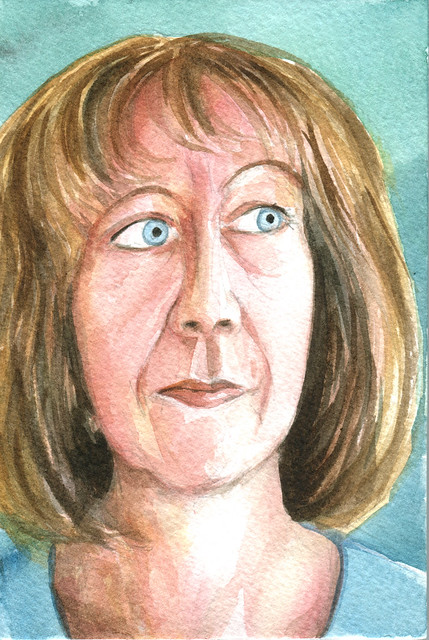
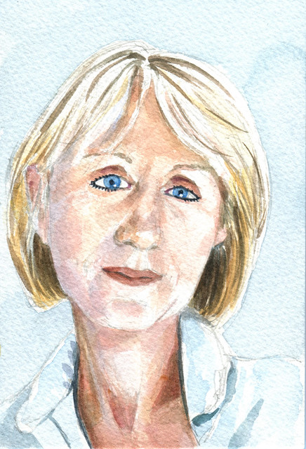
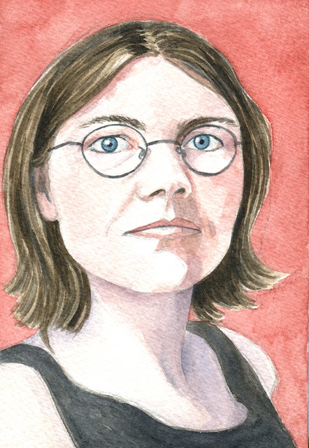
Until now! After trying a postcard sized watercolour portrait I have managed to stick to this style (for some of the time anyway). Here are some of my latest paintings, all watercolours painted on postcard sized watercolour paper.


Stella Tooth ~ Portrait Artist from London.
Postcard sized watercolour
Find out more about Stella and her art at her website here


Susanne Dutoit ~ Artist
Postcard sized watercolour
See Susanne's stunning art on her photostream here


Paulien Maria ~ Documentary Film maker
Postcard sized watercolour
Visit Paulien's Blog here


Arturo Espinosa ~ Artist
Postcard sized watercolour
See Arturo's beautiful artwork on his photostream here

You can see all of the portraits I've done for Julia Kay's Portrait Party here
And you can find out more about the Party at the JKPP Blog

Thursday, 10 March 2011

Portraits 2010

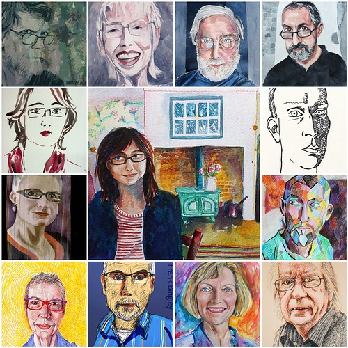
Julia Kay's Portrait Party has been such a huge inspiration to me in 2010, I've explored lots of different styles and techniques and learnt loads from all of the amazing work everyone else has been producing. These are some of my favourites from the portraits I've done.
I just wish I had more time to spend painting and drawing everyone!

Some of my JKPP faves

1. Sue Hodnett - Artist, (central picture) Watercolour
2. NC Mallory - Artist, Digital (Photoshop)
3. Valerie Beeby (Purple Owl), Watercolour
4. Shitao 师涛 - Tim Williams, Artist, Watercolour
5. Giorgio Bordin, Watercolour
6. Anna Black, Watercolour
7. Neil Davidson, Pen
8. Serious Erica ~ homage to John Bavaro, I-Phone
9. Straw Herring, Watersoluble pencils
10. Anne Watkins - Artist, Fineliners
11. Frank V2 - Homage to Sue Rama, Digital (Photoshop)
12. The Happy Painter, Mixed Media
13. Hans 3/Peter Vanayk Fineliners

Created with fd's Flickr Toys

You can see all of my JKPP portraits here
See my previous New Portraits and JKPP posts

Friday, 25 June 2010

New Portraits

I've created a new portraits section on my website and started updating it with some of my recent JKPP portraits. It's such a motivating group I've really been learning new ways to paint and draw and although I've drawn many pencil portraits in the past I used to lack the confidence to paint portraits. Now I can't wait to try out a new technique on a new face. Thanks again Julia!
I've also joined a new group with similar ideals, called Doodle Face. Even more faces to have a go at!

My website home page shows a random selection of images - sometimes I just can't stop refreshing the screen to see what combination comes up next!

Here are a few of my latest favourites:

The Happy Painter - Donna

The Happy Painter

I'm a huge fan of Donna's painting style, she is so free and expressive with her watercolours, I would love to learn that skill.  I started this portrait with the hope of emulating some of Donna's style  and capturing some of her energy and happy spirit. But my initial attempt was failing to capture any likeness.
So, I dampened the face area and started again with a more accurate drawing (in my initial attempt I'd begun with watercolour without any drawing lines). I then used Gouache to build up face. I've had some lovely comments on Flickr about the texture of the skin - but I wasn't really thinking about it's texture, I was just trying to get the right colours and tones in the right places - and it seemed to work quite well. Although this isn't a perfect likeness, it's quite close and I'm pretty happy with it as a painting.

What Donna said - "Oh yeah! The eyes, the eyes have it! And I am jealous of the way you do noses and skin!!! Yeehaw. I LOVE IT!"


Fairsquare - Sean Cronin

Sean Cronin - fairsquare

Sean's drawings are stunning, he's done many beautiful portraits for JKPP including a great one of me which I posted in my last blog - it's one of my favourites and really captures my frowning stare!
After my experiments with Gouache on Watercolour paper I thought I'd have a go with some Acrylic paper I've had for years but never use. I drew a quick pencil stetch to begin with and then used a combination or watercolour and acrylics to loosely sketch in the colours and tones. Although this isn't as 'finished' as it could be I really like the fresh and loose feel of the painting, so I decided to stop before loosing that.
As soon as I'd taken a photo of the portrait it was much easier to see where i'd gone wrong with the likeness, but nevermind! I think I captured Sean's sparkly eyes and slightly cheeky smile at least.


What Sean said - "Franny, you've got me! I'm dead chuffed! This is great. Thank you so much - love this."

Devon Lawrence

Devon Lawrence

Devon is the only person so far who has chosen to tackle a portrait of me at an early age. His drawing is so beautiful and delicate, it's really lovely. Devon also has a fantastic set of photo references to choose from.

In attempt to learn from previous mistakes I tried to draw a more accurate pencil sketch before starting to paint this. Unfortunately my impatience kicked in and I didn't entirely perfect the likeness before diving in with the watercolour. In this painting I've tried to keep my washes large and fresh, and avoid having to rework them too much. I'm fairly happy with the results even though it did start to get a bit overworked in places. I also had to use a little bit of white watercolour in places to pick out the highlights - I would have preferred to have managed to keep the white paper showing for these, but I wasn't careful enough.

What Devon said - "Beautiful work Franny!"

Monday, 26 April 2010

Architecture & Collage - New Work

I seem to have a constantly growing stack of paintings and collage that I need to upload to Flickr, list on Etsy and Folksy, and tell you about here. This weekend I managed to find a bit of time to list a few things.

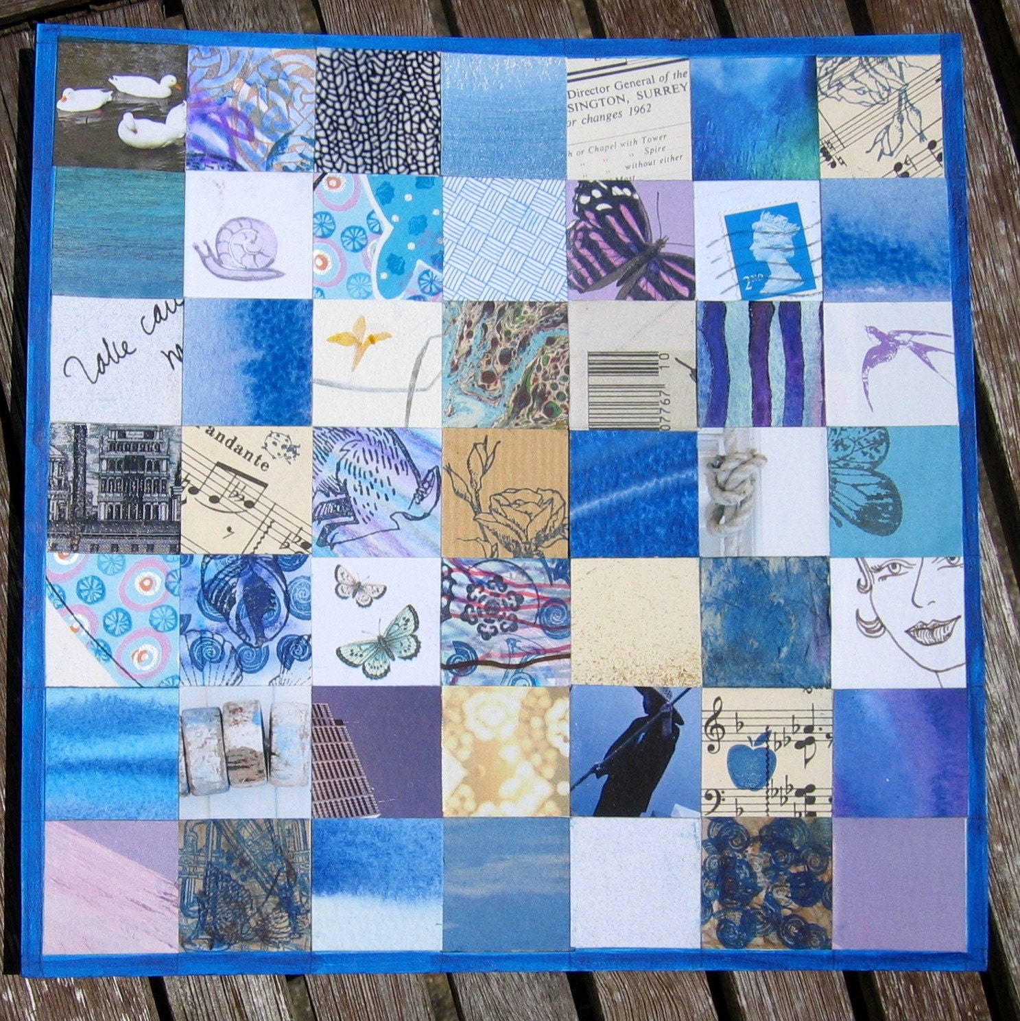
Rhapsody in Blue - Original Collage
This is a mixed media collage of blue and neutral coloured squares. I've included elements of drawing, stamping, painting, marbling and pieces from letters, magazines, sheet music and old books. I love the recycling nature of collage, creating new art out of fragments of old art, ephemera and junk!

Size: 8.5" x 8.5" (22cm x22cm)


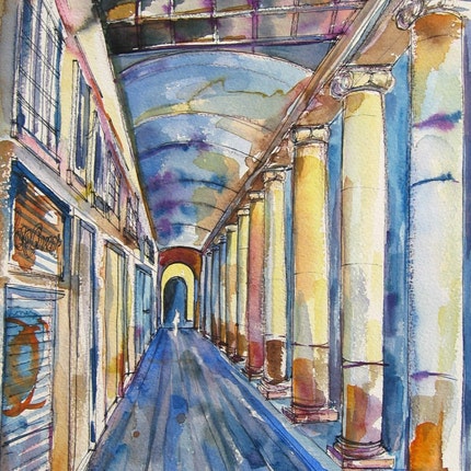
Columns - Original Watercolour

A fresh and expressive watercolour painting of an arcade of columns in Barcelona. I sketched this first using pen and ink and then I've tried to keep the painting loose and expressive.

The suggestion of a figure in front of the archway adds to the sense of depth and perspective. I've also tried to capture a feeling of urban decay and isolation.

Size: 9" x 12" (23cm x 30cm)

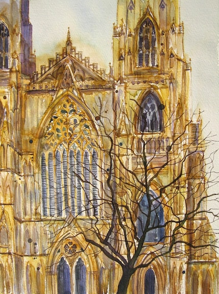
York Minster - Original Watercolour
Original pen and watercolour painting of York Minster.
I sketched a close up section of the cathedral in fine line pens. I then added colour and detail with watercolours.

I've tried to keep the painting expressive and spontaneous. The close up view creates a more interesting composition, and a lively feel.

Size: 9" x 12" (23cm x 30cm)

Friday, 16 April 2010

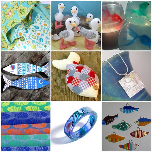
Lush Summer Art - Treasury East

My first Treasury East and I love it!
I've been really enjoying curating the Flickr galleries, so it's a great discovery to find out I can now do the same on Etsy. :-)

Click here to view the clickable Treasury: www.etsy.com/treasury/0585ea1db89cc84bf13d5800

Saturday, 20 March 2010

The Waterfront, Bournemouth

On 20th January 2010, Bournemouth Council announced that it is buying the Waterfront building on Bournemouth’s seafront – once voted England’s most hated building in a Channel 4 poll. Hurrah! This monstrosity has been ruining the view of Bournemouth's seafront for as long as I've known it. It will be so good to have a view of the beautiful coastline and seafront.


Bournemouth Council are considering a number of options as a replacement. Their main aims are:

1.To improve sea views; and
2.To bring about an all-weather attraction that is commercially viable, successful and can be enjoyed by people from all walks of life, in a building that residents can be proud of

And they're putting six options to the vote:

1.A water park
2.An interactive arts activity centre and museum
3.Tropical gardens
4.A spa
5.Performing arts space and amphitheatre
6.A family play park
7.Boutiques and bistros

Whilst I really like the idea of the arts activity centre and museum it's difficult to tell how it would work and exactly what the activities would involve. I also quite like the sound of tropical gardens - but I think any solution needs to combine a number of things - cafe, gardens, fountain & arts and crafts!

Here are my thoughts (and comments to the council) -

It would be good to have space for a local art & craft gallery or shops. There is a real lack of art & craft venues in Bournemouth so this would fill a much needed gap in the market. Craft supplies shops and boutiques would add to the creative feel e.g a bead shop, art supplies shop, model shop, knitting/embroidery supplies.

If this could be combined with an area for art and craft workshops that would be a real benefit to all ages of the community. Art and crafts are a great way to unite people and get the community talking and sharing experiences at the same time as learning new skills. It's also a great way to get people involved with the environment, Bournemouth's history, different cultures. The possibilites are endless and it's a great opportunity to improve the culture and social environment of Bournemouth.

Having the workshops so close to the inspiring sea front area would make them really attractive - painting the sea, making paper mache fish, beach hut models, sea inspired jewellery - we could really make the most of the beautiful coast and seaside attractions.

Possible workshops include:
Drawing
Watercolours
Knitting
Silver Clay jewellery
Beading
Puppet making
Electronics/robotics
Nature studies

Arts University College Bournemouth run a range of courses that could be adapted to one day or half day workshops.
Bournemouth Creatives are another source of creative people who could run workshops.

Why not have your say?
For more detail on the options and to vote see the council's website here


Thursday, 25 February 2010

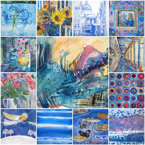
My Colours

Some of my favourite paintings. Is there a recurring theme?


My Colours
Originally uploaded by Franny B

Monday, 1 February 2010

New Paintings - Negative Painting & Frisk Film

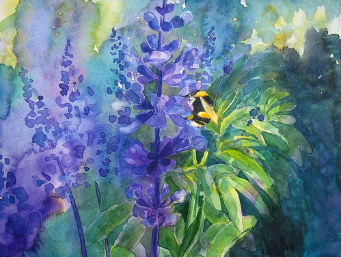
Negative Painting - Bee on salvia

Painted from Sarah M's lovely photo: www.flickr.com/photos/daftdabbler/2127038309/
From the group 'Artists Sharing Photo References' : www.flickr.com/groups/aspr/
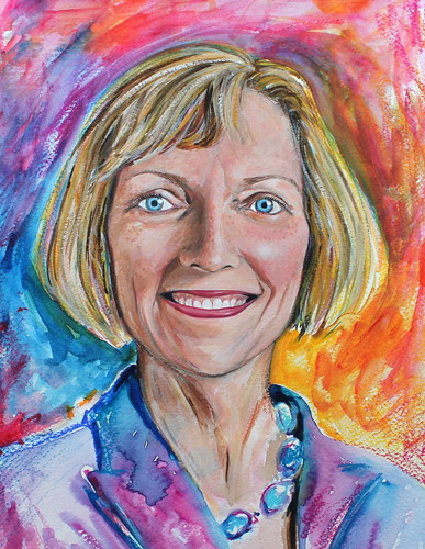
I haven't tried this sort of thing before, so the background went a bit wrong. And I didn't know what I was doing with the negative painting, so I didn't really manage it. I quite like the richness of the colours tho - I'll just have to try again!

To see some fantastic negative painting, and a great tutorial have a look at Beverly Morgan's Flickr stream. Here is a link to 'Step 1' of her tutorial: http://www.flickr.com/photos/bevmor/4291143834/
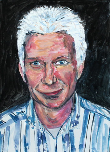
And here is an example of one of her beautiful negative paintings, "We follow the Sun":


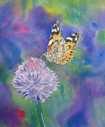
Frisk masking Film - Painted lady


I painted this background right after painting the Bee background, so at least I knew to work fast and not let parts dry. What I hadn't quite realised, was that I didn't need to put down such strong colours. I think I was just panicking in my rush to get paint down before the paper dried!

This was also my first experiment with 'Frisk' masking film. I can't believe how easy to use and brilliant it is! By the time I'd stuck it down, drawn round my drawing, unpealed it, stuck it back to the backing paper, cut out the shapes and stuck it back on the paper, it was really not sticking at all. But when I painted the edges down with water and then paint the film stayed magically in place! Now that I've got a better idea of how to use it, I won't do that sticking, unsticking thing again and I guess it will be even easier!

I'm not sure if it's worth trying to darken or lighten the background. Or if I should just learn from the mistake and have another go...

Painted from my photo: http://www.flickr.com/photos/franny_b/3859767453/in/set-72157623158286092/

Sunday, 3 January 2010

Draw Gallery - sneak preview!

It's new, it's here and it's amazing!!
How would you like to draw your own gallery in seconds?
Here are some examples, I'm sure you can do better!:

To draw your own gallery:

- Use the tools on the tool bar to draw your own gallery.
- Use the Image tool to draw any shape you want an image to appear in. You can draw as many images as you like.
- Use the Next Button tool to draw any shape you want for a next button. You can draw as many next buttons as you like.
- Use the Prev Button tool to draw any shape you want for a previous button. You can draw as many previous buttons as you like.
- Use the Decorate tool to decorate the gallery. Use the colour palette to choose your colours. Remember you can also use the green and red Next and Prev Button tools as decorations.
- The tool bar can be hidden using the toggle tab on the side.

Have a go here: The Draw Gallery


It's not completely finished yet, but it's pretty good!

At the moment it's picking up pictures from my Flickr Feed, but there may be further developments so that it can pick up any Flickr feed...

LinkWithin

Related Posts with Thumbnails